Our Work
Original HireJohnColeman Site
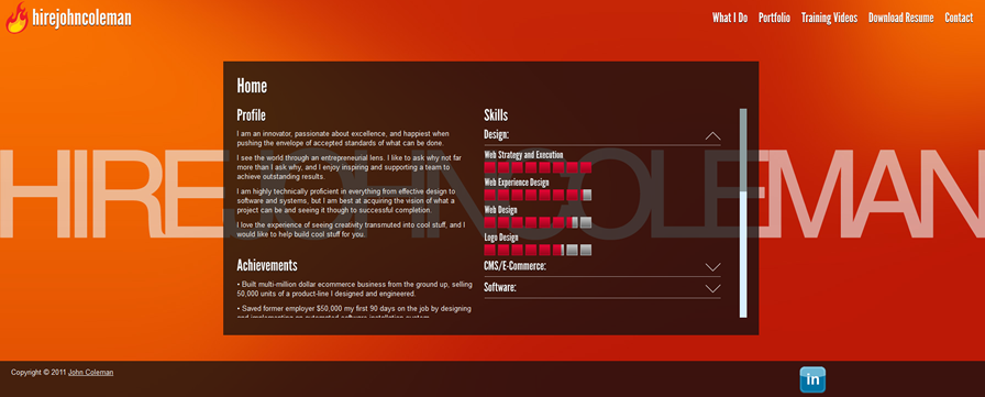
After building this site (and subsequently in the maintenance of it), though, I had a lot of my opinions changed about what I thought good design was. That is, although this site uses a lot of tricks (CSS, HTML, and JavaScript, namely), I came to believe that it is flawed in its execution. That is, when you are manipulating so many elements with tricks/hacks, it does not make the site very scalable, and with all of the added code complexity, the site ended up being far less malleable than I would like.
My biggest problem with the site, though, ended up being a philosophical one. That is, the “site” is actually just a single HTML file (which uses CSS and JavaScript to break the “site” up into its different “pages”). There is a problem with this approach, though. That is not how the web works. That is not how most normal sites work, and that is definitely not how search engines like sites to work.
To be blunt, this sort of “different for the sake of being different” design approach sort of breaks how the web works. Since a lot of the work I do is in the area of UX (User Experience) Design, with this design I am throwing away convention, which is one of the greatest UX tools at my disposal. Often, websites (or any product for that matter) is easier to use because it follows conventions that most people agree upon. Even though the site may be new to the user, the architecture and flow feel familiar.
Now, that is not to say that the world (especially the world of design) does not need change. Quite the contrary, in fact. However, change just for change sake, in my opinion, is indulgent on the behalf of the designer, especially in situations where sticking to conventions and accepted ways of doing things would make something easier and/or more pleasant to use. This original hirejohncoleman site might have been sexier from a design/eye-candy perspective, but I think the current site (the one you are on now) is not only easier to use, but gets to the heart of good UX a WHOLE lot more effectively.
Request a Quote
Already know what your project needs to take it where it needs to go? Great! Send us a quote request and we will let you how we can help you.
Contact Us
Wondering what it would take to crank up your project to the next level? Contact us and let’s chat about how we can help you realize your project’s full potential.