Our Work
NTT – Global IP Network
One of the big challenges here was wrangling all of that content and building a site this large that had a logical flow through all of the 70+ pages of content.
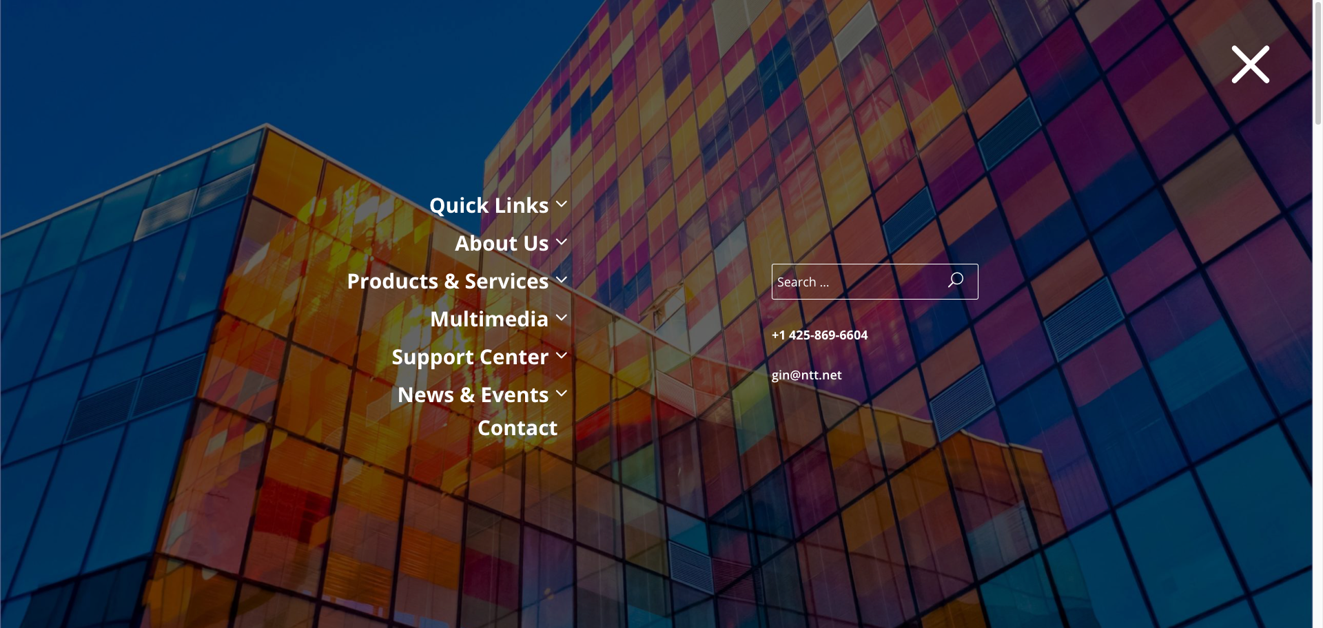
One of the ways I did this was to build a more fullscreen, interactive menu than usual. This way, the user can see all of the site content on a single, focused screen and also understand the logical heirarchy of how the pages are organized:
Although it was such a big project, I feel like the design does a good job of not only setting and maintaing a good tone, but also in matching the global corporate brand guidelines while still being unique to the individual organization.
Request a Quote
Already know what your project needs to take it where it needs to go? Great! Send us a quote request and we will let you how we can help you.
Contact Us
Wondering what it would take to crank up your project to the next level? Contact us and let’s chat about how we can help you realize your project’s full potential.


