Our Work
1123Interactive Logo
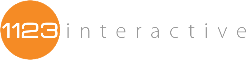
This was a quickie project for me, but I was really pleased with how this one turned out. This logo is one of the more simple ones I have done, but sometimes good ideas are just that, simple, and any additional polishing or embellishment just ends up detracting from the design.
The thing I like the most about this design is the typography. I like the juxtaposition between the two main fonts. The font used for the number portion of the logo is a very wide, and to me, is a bit of a heavy font. Not heavy so much that it is bold/wide, but that the curves/angles are exaggerated. In contrast is the word-portion, which is very light and clean, almost technical. Unlike the number font, its curves are very subtle and light. To match the two up, I used pretty extreme kerning on wording to give it a more even visual weight (as compared to the font used in the number portion). Lastly, I like the addition of the circle around the numbers, not only because it draws the eyes in, but I like how it compliments the rounded nature of the number font.
Any type of design is subjective, especially for designs that show taste in typography and/or iconography, but I like this one. I like how the opposed elements play off of each other, creating an overall balance. Additionally, the very-horizontal nature of this logo works really well for web-branding (since it does not eat up much vertical space), but it also still works pretty well for printing too. Here is the business card design:

Design Specifics:
“1123” Font: Michroma Semi-Bold, Color #fffffff
“Interactive” Font: Myriad Pro Light, Color, #999999
Circle Color: #f58b25
Request a Quote
Already know what your project needs to take it where it needs to go? Great! Send us a quote request and we will let you how we can help you.
Contact Us
Wondering what it would take to crank up your project to the next level? Contact us and let’s chat about how we can help you realize your project’s full potential.