Our Work
Visual Design for Enterprise Software Company
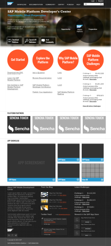
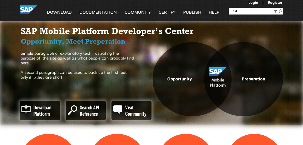
There were a number of things we tried to work in here. First off, since there is so much going on with the page, we wanted to give the page a little bit of character, which is achieved through the geometric imagery. Plus, the site is for a project called “Beehive”, hence the hexagon pattern in the top banner. Here is the home page in its entirety:

Overall, we were going for something clean, and professional, but not too stuffy. The material on this page/site can get a little dense, so we wanted to inject a bit of personality into the page with liberal use of color and round/soft shapes.
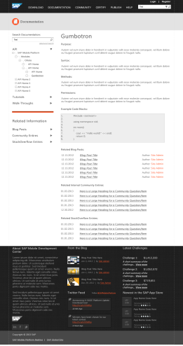
In addition to the landing page, we also designed what a (standard) content page would look like:

Request a Quote
Already know what your project needs to take it where it needs to go? Great! Send us a quote request and we will let you how we can help you.
Contact Us
Wondering what it would take to crank up your project to the next level? Contact us and let’s chat about how we can help you realize your project’s full potential.

